- Joined
- Nov 16, 2021
- Messages
- 1,409
- Points
- 153
Yep, I have smtu here, not smutNo smut. 0/10 lol jk
Yep, I have smtu here, not smutNo smut. 0/10 lol jk
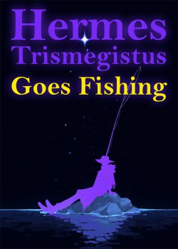
The negative space in the middle is making the title and the Hermes pop up. I deliberately chose black as a negative space, keeping few particles so it doesn't look as empty, and the legs and the rod create arrow like structure that makes the silhouette to pop up. I need to make better font then, I just slapped this title in 2 mins lolahw
7/10 I like the whole bottom bit past the halfway point of the cover(the image is a little blurry for me btw idk if you know that).The thing getting at me is the text on the cover, it's interrupting the cover art too much, I feel like the texts needs to either be more dynamic or at a different spot.
Or you could go the goose bumps route and separate the text and cover art all together...View attachment 36730
Also If you want some ideas for the text and other stuff let me know, I still got some ideas if you want some...
oh ok although question why the yellow text colour?The negative space in the middle is making the title and the Hermes pop up. I deliberately chose black as a negative space, keeping few particles so it doesn't look as empty, and the legs and the rod create arrow like structure that makes the silhouette to pop up. I need to make better font then, I just slapped this title in 2 mins lol
Purple is complementary to yellow. Color theory 101. Also, the hermes is associated with purple, making the whimsical "goes fishing" to be seen even more. Yellow also the positive color, which subconsciously makes the art look more comedicoh ok although question why the yellow text colour?
That makes sense though since it reminded me of the Aladdin movie lol, also sorry I can't help myself with this bit but what do you think, as an idea, if you had the "Goes fishing" text in the water with the texts opacity turned down and some yellow fishes swimming around it? just had that as an idea when I was looking at your cover, it's pretty neat(your cover).Purple is complementary to yellow. Color theory 101. Also, the hermes is associated with purple, making the whimsical "goes fishing" to be seen even more. Yellow also the positive color, which subconsciously makes the art look more comedic
10/10 comment.*eats cheese* Mmmmm, tasty!
The rock is more surrounded by, closer to the water than I imagined. But good.I'm winning currently by asking rate thy cover
*eats the cheese* WHY U NO SERVE WINE WITH CHEESE!
Why U no let me win!?I am currently winning.