I was super busy so I wasn't able to check on this thread for a while

And now there's so many incredible books and covers to go through I don't know where to begin! Welp, this is going to be a super long text, I apologize if I forgot anyone in the procress but I do want to try giving some love to allthe artworks and maybe offer my two cents on them like I did with all the remaining previous covers
Wow, that's quite the compliment. Under the Oak Tree is a fantastic story with insane artwork. XD Thank you very much.
I probably won't be adding typography to it, though. I kind of forgot about that when I did that cover
. When I do, I adapt the design to the Typo ahead of time. Like with my current story.
View attachment 32423
I also love this cover you made, I think I even prefer this one to the previous just because I am a sucker for blue! It gives me the vibes of ancient china with those instruments that they usually play (I don't know the names for it though)! Love it!
Two of my novels had AI Covers before, but I commissioned an artist to have them changed.
AI Covers:
New Covers:
I love seeing authors commissioning real artists whenever they have a possibility to do so! I'm so proud! The covers look amazing, whoever you commission did a terrific job. I personally really love the sort of abstract butterfly. However, a small thing I'd like to point out, it's a bit hard for the word "princess" in your second cover to be read to I'd advise you to their change the font, change the sizing (puting the "as a" smaller and "vampire princess" bigger) or merely place a low opacity rectangle so the readability can increase.
This reminded me of Knights of Sidonia.
Anyway, here's my cover!
View attachment 32543
Holy, I love this! It looks great, honestly I don't think I have anything to point out from the first look. I think both characters look great and the cover efficently explains your major plot point across, although I really REALLY like the way the title was made - it looks so different! I love it
I paid more money than I wanted to for this, but I'm still dissatisfied.
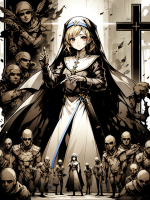
Althea (on the left) is NOT supposed to be that homely.
Curious about what people think about this. I think it stands out a lot, but maybe the style isn't very attractive to most people, especially on sites likr RR and SH where an anime/mange aesthetic seems to be the expectation for covers.
I did respond in your older thread regarding this picture so I won't dwindle a lot but I felt bad not replying to you too since you did take some part of your time to actually showcase your cover here. I like the vibe although it's not really my cup of tea! But it looks good, just needs a handful of tweaks here and there to make it slightly better
Well then, new writer here!
View attachment 32563
The cover looks good, I think it's AI generated (correct me if I am wrong though, I'm still not the best at discerning it) so I won't be providing any criticism regarding the art itself but I can offer my two dimes on how you placed the title and name. To increase reader readibility I'd place your name vertically, all in caps with an easy to read lettering either on top or the bottom of the book plus with no decrease in opacity. Then the title I'd make "Utility System" way bigger and then "offered an inch" smaller and then "taking a mile" bigger (but still smaller in comparison to utility systems". This will give some depth to the piece and I think it will help you out in the long run. I'd also probably choose a different font because I don't get that futuristic vibe you usually get from LitRPG novels with that lettering. Other than that, I like it!
I don't even know if I should ever change my cover. Like, what would I even change it into? What would prompt me to do it? Well, I'm even using an A.I. for my cover and it even came from someone else, so I can't really easily change it into something.
Hmm
I see. As an artist I can tell you some authors do struggle with that because it's harder for someone without experience to envision their book cover off the bat, without any references and such. However, keep something in mind, the book is completely yours and even if you don't know exactly what your cover could be about maybe if you take a reader's point of view into your story, an idea might sprout. For example, in my story the main character is a villain and I do try to convey it throughout all the covers I made and I also added roses and chess pieces every now and then because they end up being related to the story, as if she is controlling the pieces.
Try to think "what would someone who doesn't know anything about the story make of this? would they understand the basic premise?" and move on from there. I hope that helps!
View attachment 32577
Original file was too large to upload so that's funny. Commisioned an artist to make it for me, really happy with the result
Uhhhh I love this! The color pallette is *chef's kiss*! The contrast looks great and I love the little girl's socks, I used to have a pair just like that with two bollocks coming from the sides (now my feet are too big and don't fit anymore
). I think the only critic I have is the subtitle - I like it but I personally would change the font, I think there's something missingand I think it doesn't really match the "AURA" font (whichI think it looks marvellous by the way, the contrast of future with an art piece that looks avant gard, it's incredible!).
I'm so sorry, your cover is not available anymore so I can't say anything about it
I finished drawing the proper cover for my novel yesterday!
View attachment 33434
I. ABSOLUTELY. LOVE. THIS. The snake whose scales appears to be made of a small calleidoscope is sooo pretty! Honestly I think you did a great work! My two cents would be this, I think your MC is a tad bit too dark, I know it's because the sun is setting but I'd had some highlights to the center of her body specially her face so it pops out to the reader! And I can't really tell if it's pure white on the title but I usually advise refraining from using pure white, I think a pretty light purple (still almost white but with a hinge of purple) would do great! Regardless, I think this is a marvellous piece, super well done!

I spent most of yesterday working on this, just so I could start uploading the story to the site!
View attachment 34148
But hear me out, the little siren witch with the grimoire IS JUST SO PRETTY!? I love her! The character concept and creation is amazing, really. Overall the whole cover looks great and I love it but I'll offer my advices so take it with a grain of salt. First, I'd remove the transparency in the title as that might affect readability for the readers who are finding your book for the first time. Secondly, have you tried shading and shifting your lineart color? Try unsing some warmers tones here and there and you'll see an astronomical difference, trust me (I learned this trick wayyyy too late). Lastly, there is a bit of a quality gap between the background and your characters so I assume the background might be AI (not judging) so I'd try to find just a better quality picture since it looks very pixelated for everything else. Hope it helps a little bit
my cover is the only thing worse than my novel so I'll pass
That's alright, if you don't feel confortable you don't need to share it. We don't want anyone to be forced to do anything they don't want to do
I started this pretty recently so feel free to stop by :)
View attachment 34276
This looks incredible! I don't know what the word for the pretty glass is but I THINK IT LOOKS SO GOOD. I'm a sucker for those. Honestly really top tier art, I truly don't have anything to note or account for. Also your female character reminds me so much of Esdeath (I don't remember the anime she is from though) but I love it. Great work!
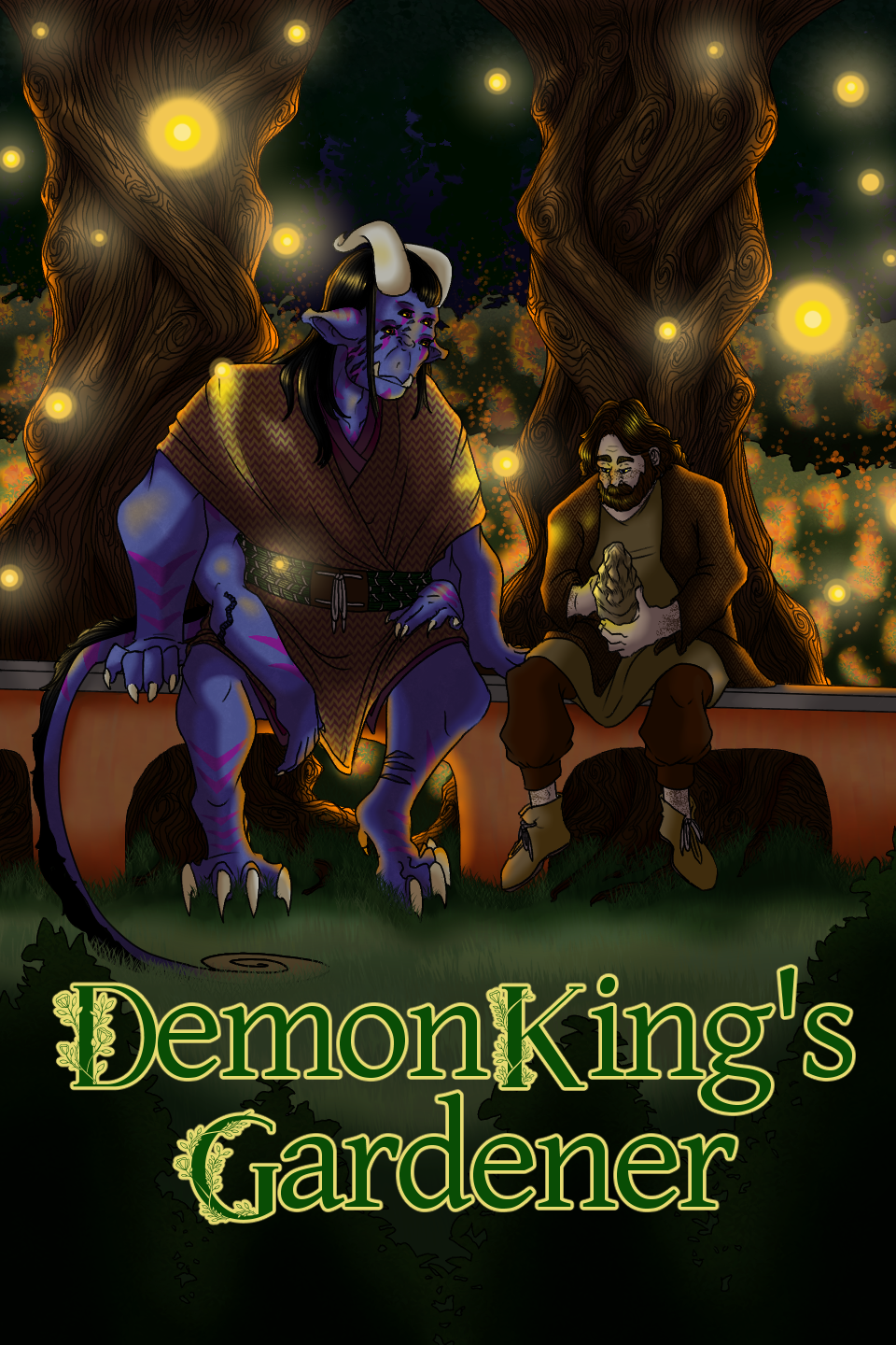
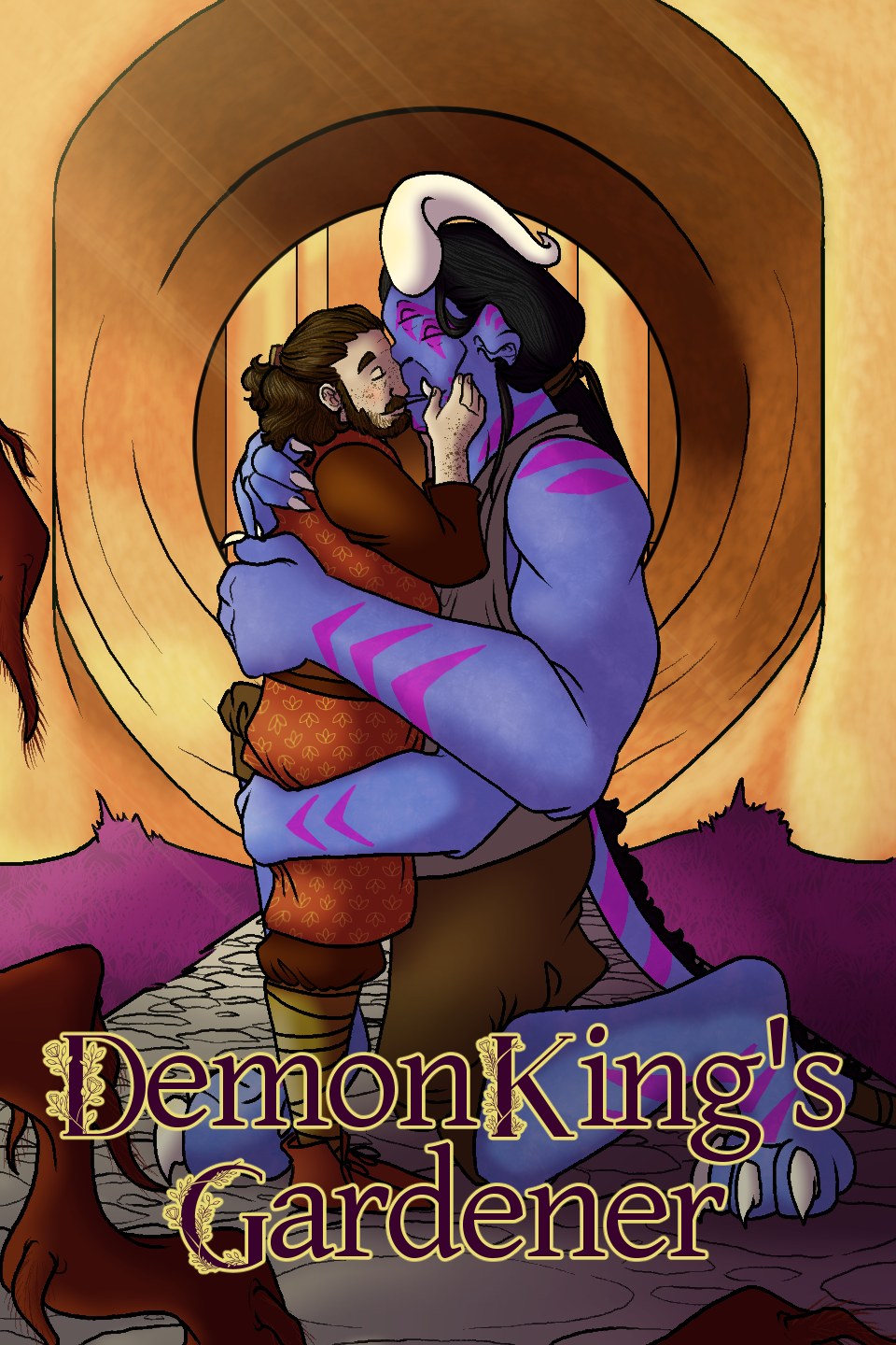
I started posting DKG here after 2 years posting on Tapas and RR, so I love an opportunity to post all the covers I've done for it, ha ha! (P.S. my favorite of yours is the third one - I think you really nailed the composition in that one! It frames the MC really well!)
Thank you so much! That piece took me more than 8+ to complete so it was quite a long trip
But we made it happen!
Now back to your beautiful covers, I don't usually draw fantastical elements like beasts and such but I'll try to give any feedback. I did state this in a previous post for another artist but have you tried coloring your linework with different shades? I think it would increase the quality tenfold, I only started doing this quite late too but it was a little cheat code that a friend taught me! Also since you do have a lot of covers I'd maybe create a secondary title for each book? So it's easier to not get mixed up maybe, I don't know if you are diving them by volumes, arcs or full books. It's just a penny for your thoughts though. Uh, and also I think your covers would look marvellous with some flowers or nature-like framing elements, since it's a "gardener" you could use that!
From all your beautiful covers I to prefer the 7th one, where he is holding the King! I think it really showcases the vibe of the whole story hihihi
Wound up with:
View attachment 34289 clip art and filters with AI for the background
Also started a "Smut" Isekai thing with a working title of
Crossed Destiny but no clue what to do with a cover there so far.
Oh, and used an idea I tossed out and then abandoned here for a now complete first draft story on HoneyFeed - cover is hand drawn from a template, text added in PaintShopPro:
View attachment 34290
I like the first one but it is a bit messy composition wise I'd say - I feel like I can't really understand what the story is about. My advice is focus on having one or two main elements maximum and all the remaining ones will be to merely make these two better / more important. So for example, this is a cover I did for my own book:
As you can see the main piece is the hourglass and the rose, anything else that was added was merely to make them "pop" more! I don't know if I'm explaining myself correctly... but I hope you get my point!
Regarding your second cover, I like it! However I'd change the size of the titles, maybe move it around a little bit just so it has some extra depth to the picture. I find that shifting sizes in titles, colors and something even placing a small outer layer makes a huge difference in readability. I'd also change the background since it might be a bit too much for dark themed readers (aka someone like me
)
But listen, great job in both! It must've taken you quite a long time to make this and I think you did great! I just hope you kinda see where I'm going for and see it as constructive criticism!
MIne are AI. I can't draw and I'm poor.
It's alright, like I usually say, I think that when people are starting out with their writting it's quite normal to start using AI just for the simple fact that most of us won't have the necessary funding to afford it - it's considered a hobby. Just make sure that whenever you are famous and rich you commission a real artist
AI doesn't need food but we do ahahaha
Excellent cover artwork! You work is Manga...or is it just the style you chose for the "outside"?
Thank you so much! I'm glad you like it. My artwork, well, I guess it's a bit on the anime end - I don't know. I know it's not completely anime but it's not cartoon either so somewhere in the between? But yes, this is mostly my artstyle, I don't really know how to draw differently
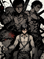
I only just posted the third chapter of my biweekly serial fantasy novel, every chapter comes with an illustration for you to enjoy ;) Grab your popcorn, sit back, and enjoy each illustrated chapter, you're about to go for a wild ride ;) Here's the cover! I hope you like it :)
View attachment 34330
Uhhhh I like this. It looks cool, the golden bird that I don't remember the name for while I'm writting this but as soon as I hit "post reply" I'll for sure remember it
However, my two cents are I don't think that red blob of light in the left side is doing anything for the painting, I think it's a bit distracting from the original and center of the piece so I'd probably remove it. I'd also take out that orange background below the letters because to be honest, I can't really understand what it is and if you take it out it's gonna look so sick because those letters are going to pop a lot more! I also really like the hint of green - it makes it look a lot more golden! Keep it up!
Today I worked on the cover art for book2 of my series! Important, seeing how Book1 is now entirely available online and I didn't want to start uploading chapters of book2 until I had a nice cover!
View attachment 34396
Ladies and gentleman, we have ourselves an ARTIST! I LOVE THIS CLO! It's so cute! I specially like the handsome young men with a green tie who is clearly flirting with me - I won't take no for an answer
It looks marvellous, great work!
By the wonderful
NEKO Modoki
One of these days I'll figure out typography or commission someone for a logo, too.
THIS LOOKS INSANE!? WHAT THE HELL!? I LOVE THIS SO MUCH! It's completely marvellous, incredible *chefs kiss*. I have nothing to point out however I'm a sucker for titles
So I'd add a title to it but that's just me, I know some people prefer not to! I love it though!! Amazing work!
Look! It's the mermaid again! She's so pretty, I swear I'm shrimping for her

Once again Clo, these look marvellous but I will offer my two cents: on the elf, I'd place part of the wind particles above him and to the shadow person I'd make the darkness in him as well, surrounding the furthest part of his hood so it looks like the darkness is emmanating from him! Thiswill give a lof of more depth to it.
I don't know which software you use to draw but I'd also recommend you trying our the "Overlay, Multiply, Shine / Shade" layer settings as you will see how great they are for ambience, shadding and adding all of these extra little details that make the piece come together.
The Dungeon. A harsh world where death is a constant companion. Powerful monsters roam freely, and every element, terrain, flora, and environment, conspires to eliminate intruders. The moment you step inside, there are no guarantees for your life. Many lose their sanity before their bodies...

www.scribblehub.com
Ahhh it's too small Royal, I can't see it
I'm sorry!
ALRIGHT GUYS I FINALLY DID IT! I WENT THROUGH EVERY SINGLE ONE OF YOU SOMEHOW!
Thank you so much everyone for sharing your marvellous covers, I'll keep on checking from time to time still but hey, I love this. Keep them coming. These are all marvellous and stunning works
OK I DID MISS ONE PERSON, I'M SO SORRY
But here's my two cents, I like it. I think it looks pretty, however, I think you could choose a different font that would better fit the theme, maybe something more spooky - because yandere's might be sweet and all ... until they are not
And also I'd maybe create a vignette effect, I think it would suit it! And probably remove or change a little bit the white parts in the middle, it makes the image itself slightly unreadable. Hope it helps hihihi