Not_A_Symphony
Picasso 2.0
- Joined
- Mar 15, 2021
- Messages
- 181
- Points
- 83
Oh I see, that makes sense. Didn't you get like a massive book or something? Since it's 3 into 1, might become a lot larger no?I didn't change the titles, there's just more than one book. At first it was going to be a trilogy (Slayer/Sphinx, Convict/Captive, Protector/Peacemaker) but I eventually just merged books 2 and 3 together into one book.

Also your other covers are great as well! But I must say my favorites are the ones from Rogue Wolf and Nuyu Prescription! They look really amazing, I swear, I'd buy the book only on those alone, especially the 2nd one I stated, it's so funny
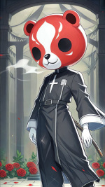
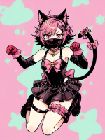
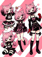
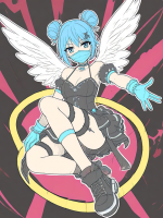
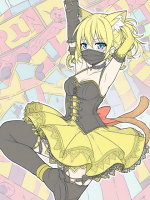
I love these! I love how your style is so consistent throughout all of them but you can definetly see the improvement over time! I gotta say though, number 9 and 16 have a lot of fan serviceThese are the covers I used in Honeyfeed. The Saint Series eventually ended with 20 books, and a corresponding number of artworks.
View attachment 31586View attachment 31587View attachment 31588View attachment 31589
View attachment 31590View attachment 31591View attachment 31592View attachment 31593View attachment 31594View attachment 31595
View attachment 31596View attachment 31597View attachment 31598View attachment 31599View attachment 31600View attachment 31601View attachment 31602View attachment 31604View attachment 31605View attachment 31606
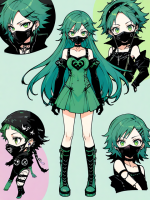
These are the covers I used for my novel's version here in ScribbleHub. As I uploaded it here by 'arc,' I'm still working on this particular series of illustrations...I'm already in 5th and final arc's artwork.
View attachment 31607View attachment 31608View attachment 31609View attachment 31610
I have other stories, which are still in the works, like Paulina Rex. Paulina Rex is an alternate reality/history novel set in the future, in the Philippines, which is my country of origin.
View attachment 31613
The Ballad of School Hallways is a semi-autobio about my experiences in my old school, which I originally wrote to deal with the 'unfinished stuff' I had in that place.
View attachment 31614View attachment 31615
Lovette is a short story I entered in YOASOBI x HoneyFeed contest. Since it didn't win, I plan to continue it as an anthology of stories...
View attachment 31616
DECK is the oldest novel I wrote, dating back to 2008. It was originally a manga, but because I find it hard to continue drawing chapters without an assistant, I switched to novel format. As of now, it's currently in hiatus, but I do plan to continue writing it come 2025.
View attachment 31617
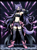
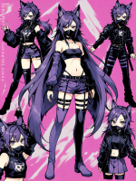
I drew these covers via pen and pencil, which were also traditionally inked. The only digital in these artworks are the colors, which I did using Photoshop. If you'll also notice, there is a wide range of artwork quality, as these works came from 2021 up to present.
hehe boobaAlso do you do them yourself? If so, do you do them digitally or by paper and then digitalize into a file? Asking because your art looks very "papery" if that makes sense (?) Regardless it's amazing work!
There are very few artists on this forum that do non-anime art so I understand... Have you tried Fiverr? You can find cheap artwork from new freelancer artists there that will for sure do non-anime art! I wish I knew someone that did non-anime art, otherwise I would refer them to you... I hope you can manage to find an artist that fits your criteria soon!The current images are place holders, as I write I hope to commission a remake with human made art, but due my insistence on non anime art I'm hamstrung. I want picture based solely of high quality, but that's expensive
And by the way, I wasn't judging your choice on going with AI, I know it's hard to find good artists with affordable pricing in today's economy that will go with the style you want to. I just truly hope eventually you will support a human artist that will support your work
Hear me out... but really HEAR ME OUT... WHO'S THAT DADDY ON THE LAST PANNEL? He looks stunning, the way I gasped -- brother, great work! Really, it looks amazing. I can't wait to see the finished pieceAncient

Old

WIP

The covers are not for the same story, but the last one is a spin-off from the first one (not the same characters).
You are so productive omg, writting so many stories at once - I could neverRejected first try (too risque) for Strange Awakening (heavily edited AI image)
View attachment 31631
Current covers for stories on this site (all heavily edited from initial AI images):
View attachment 31633View attachment 31635View attachment 31636
Current cover for story only posted on Royal Road (made from clip art):
View attachment 31637
Stories not posted anywhere yet: (mostly composed from clip art)
View attachment 31638View attachment 31639
And there are the few I've begun with either no idea what the covers would look like
- Stranded (About a shape shifting alien separated from the hive-mind that controlled him, trying to understand Earth - and warn it that his former people are poised to invade soon)
- Out of Time (Two beings from Ancient Egypt brought together to clash in the modern world, with a pair of FBI agents caught in the mix)
- A Subtle Distortion (Time travel story, sort of; so far having a kind of Orphan Black moment - if you've heard the story the guys behind that show tell, they were brainstorming ideas for a show when they got the call to pitch a pilot. All they had was a title (Orphan Black) and an opening scene (girl sees herself commit suicide on the subway), and no idea where to go from that ... but were given funding for a pilot and 45 days to come up with something; allegedly they had five characters written and three scenes when Tatiana Maslany read for the leads and asked: "So, what's their story, are these girls clones or something?" and that was the push they needed to build an epic from... just waiting for that push here)
- Blood Diamond (sequel to Diamond in the Rough, so want something noir-ish but keep waffling on what I want to include)
Or where I know what I want but have no clue how to build it without shelling out a big commission;
- The Grey Files (would want something like half a modern city scape, half a "traditional fantasy" city in the background with a gold 1970s Chevy Imapala airborne and passing through the "blur" between them)
I'm writting like 2-4 and even then I write them from time to time, so kudos to you!I see that you really like sci-fi and older stories, it's a very good concept, what if you mixed both of them up? I wonder what would come out... aliens in the middle of 1920 or in ancient greece - maybe we have, all this time, following Sócrates without knowing he was an alien *tan tan tan taaaaaan*
I like your covers, especially the one from "Between the Worlds", I'd say that's my favorite from the lot!
If you want to find free images to use in RR due to their anti-AI I'd suggest you trying Pixabay and other similar websites. You can use the royalty free images from there, or even Canva!
Thank you so much everyone for sharing your covers with me, I never thought this thread would get this much traction and end up sharing so many different experiences
 You guys rock ~