You are using an out of date browser. It may not display this or other websites correctly.
You should upgrade or use an alternative browser.
You should upgrade or use an alternative browser.
Looking for feedback on half finished cover
- Thread starter -mango-
- Start date
-mango-
New member
- Joined
- Nov 11, 2025
- Messages
- 6
- Points
- 3
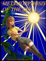
Thanks, but do u think the overall is working?I'd try to change that flat blue background first, then probably make the text more easily readable.
Slydda
New member
- Joined
- Sep 14, 2025
- Messages
- 9
- Points
- 3
Maybe it would look better to make the rays of the sun thicker and more uniform? Also the font isn't great for book covers, it looks like Times New Roman.
The girl looks really good though, the light shining on her face draws the eye in and her expression looks interesting.
The girl looks really good though, the light shining on her face draws the eye in and her expression looks interesting.
IWILLDEFYTHEHEAVENS
Active member
- Joined
- Dec 26, 2025
- Messages
- 62
- Points
- 33
The green paired with the red blurs my vision somewhat, are they supposed to be a design?, I can't make them out
tiaf
ゞ(シㅇ3ㅇ)っ•♥•Speak fishy, read BL.•♥•
- Joined
- May 29, 2019
- Messages
- 3,153
- Points
- 183
The rays should all originate from the middle of the sun. Also they would look better with varying opacity and they could gradually fade out.
For the flowers you’d search for free stock graphics.
the bg blue should be desaturated a bit
the girl could get some darker shadow
For the flowers you’d search for free stock graphics.
the bg blue should be desaturated a bit
the girl could get some darker shadow
Kalliel
Grind, Future, A Beautiful Star
- Joined
- Aug 8, 2023
- Messages
- 532
- Points
- 133
The composition is fine, though the color choices make it look somewhat glaring. Considering that this is a book cover, it should be fine once you fix the background. Desaturate the blue or change it to something else.Thanks, but do u think the overall is working?
1) Way too saturated bg colors and quite bland (compared to the bg) character. Could work as a high saturated work, but currently the colors are kinda… clashing? The character and the bg don’t connect.
2) Many colors, may be easier to go for a 2-3 color only palette (blue - yellow) or (blue - yellow - orange)
Idk abt the title but it’s also clashing with the work… probably would be better to experiment with it.
Overall good compo and values :>
2) Many colors, may be easier to go for a 2-3 color only palette (blue - yellow) or (blue - yellow - orange)
Idk abt the title but it’s also clashing with the work… probably would be better to experiment with it.
Overall good compo and values :>
McPhoenixDavid
ִֶָ. ..?Chibi Writer Nix ࣪ ִֶָ?་༘࿐
- Joined
- Sep 24, 2025
- Messages
- 223
- Points
- 63
Bad anatomy. Too long neck. Too thin arms, too narrow waist, weird chest, wrong hair details.Hi I’m currently working on the cover and I finished the line art and the most basic stuff. I wanted to know if there is anything I should add or change before rendering. Any critique is welcome. View attachment 44403
Bad background.
It's too unfitting.
Is that a sun? Or an energy orb? It looks too flat. The rays look like beams.
The flowers look weird.
Can't read the letters.
The shadows are not enough.
Hope this helps.
FRWriter
Well-known member
- Joined
- Oct 3, 2024
- Messages
- 618
- Points
- 108
Looks great, I like it.
However, if you only see a tiny version of it, I can promise you that people can't read the title. The font is not really suitable.
The red flowers also look a little LQ, almost like a 5-minute paint job. Overall, this is still a great cover, though.
However, if you only see a tiny version of it, I can promise you that people can't read the title. The font is not really suitable.
The red flowers also look a little LQ, almost like a 5-minute paint job. Overall, this is still a great cover, though.
tiaf
ゞ(シㅇ3ㅇ)っ•♥•Speak fishy, read BL.•♥•
- Joined
- May 29, 2019
- Messages
- 3,153
- Points
- 183
The overall shape of the plant is not flattering. Also blue and yellow not the best combo to use when you want the character to stick out.So if I change the red flowers to a more muted yellow or dark gold, will it look better?
Disagree.Also blue and yellow not the best combo to use when you want the character to stick out.
https://x.com/veron_1411/status/1936484309126222117?s=46
https://x.com/veron_1411/status/1833281637347402154?s=46
Links to an artist who drew some works only using blue and yellow and the drawings are stunning. (This is what I had in mind when recommending a blue-yellow palette.)
Although blue and yellow are not complementary like yellow and purple it’s still a good color combo.
Kalliel
Grind, Future, A Beautiful Star
- Joined
- Aug 8, 2023
- Messages
- 532
- Points
- 133
Except when you take a look at those works, you'd notice that the first one is yellow and cyan, while the latter ones lean more toward purple than blue.Links to an artist who drew some works only using blue and yellow and the drawings are stunning.
That said, yellow and blue can certainly work well. It's just that if the OP wants their character to stand out, those colors would need to be desaturated properly.
Yeah my bad, I didn’t mean it like 100% blue, but those can still be considered some kind of blue (cyan is just greenish blue and the other is more of a purplish blue). Couldn’t remember an artwork that hits the mark right away ToT. But I’m sure it’s out there.Except when you take a look at those works, you'd notice that the first one is yellow and cyan, while the latter ones lean more toward purple than blue.
tiaf
ゞ(シㅇ3ㅇ)っ•♥•Speak fishy, read BL.•♥•
- Joined
- May 29, 2019
- Messages
- 3,153
- Points
- 183
The advice I gave was this artwork specific with the quickest and easiest possible solution for OP.Disagree.
https://x.com/veron_1411/status/1936484309126222117?s=46
https://x.com/veron_1411/status/1833281637347402154?s=46
Links to an artist who drew some works only using blue and yellow and the drawings are stunning. (This is what I had in mind when recommending a blue-yellow palette.)
Although blue and yellow are not complementary like yellow and purple it’s still a good color combo.
All given examples have the entire piece in the color scheme that is complementary. OP has colored their character in another complementary way yellow-gray/black.
It can work but it incredible hard and both examples you gave were in a painterly style and differ greatly from OP’s style which is clearly a beginner with cel shading. They won’t be able to pull it off with their current skill set.
I don’t say it can’t work, just not for this specific piece where OP has a different concept already cooked up. There is an entire 6 colors in this simple artwork and they all clash. I won’t tell OP has to change their characters color as that would be harder/they may have meaning and it’s good to have the yellow in the clothes as it already exists in the sun.
Changing background and flower color seems the easier way.
Yeah. Because you said that blue and yellow are not the best combo to use when you want the character to stick out. I provided examples to prove that claim is wrong and that claim only.All given examples have the entire piece in the color scheme that is complementary.
Since when color correction was such a high skill? It's not about style. You can have whatever style, but it does not depend on the colors that you use.It can work but it incredible hard and both examples you gave were in a painterly style and differ greatly from OP’s style which is clearly a beginner with cel shading. They won’t be able to pull it off with their current skill set.
Simply changed the colors of the flowers. Added some yellow to the character. (And softened the bg). That's it. Now it's blue and yellow. And to me it works just fine.
The artworks I linked were only an example of a working color scheme that looks good and could possible look good on their artwork.
AoiKanzaki1990
New member
- Joined
- Nov 23, 2025
- Messages
- 1
- Points
- 1
I feel like everyone is forgetting that the book cover is unfinished and the line art is pretty good. My feedback would be that the green and red are like too saturated, it would be better if the creator would make it less saturated. I also don't think the text font is very good and that they should make the text colour also a different one. If not, I guess you can remove the title because some fiction don't even have the title on the cover page. Anyways, I feel like this cover could be pretty good if you finish it. At least the creator bothered to try and draw and not use AI. Also, did everyone who commented even check out the book? Because I think the book has potential.
Esden-Noir
I might think a lot, so let me think
- Joined
- Nov 15, 2025
- Messages
- 57
- Points
- 18
So basically I'd say change her arms they seem a bit too thin. Shadows could use a little bit more detail, but overall it's very well done for a unfinished cover art. But the major problem I see is the title, the color is kinda messing with its visibility and a title should be the main attraction of the "cover art" here I just made the colors a little more vibrant and made the text more visible. I didn't want to change any anotomy because it's your artstyle I didn't want to butt in. And the red flowers were kinda a miss so I changed them to blue while adding some details to them.Hi I’m currently working on the cover and I finished the line art and the most basic stuff. I wanted to know if there is anything I should add or change before rendering. Any critique is welcome. View attachment 44403
Attachments
-
 Color correction.jpg320.9 KB · Views: 38
FRWriter
Well-known member
- Joined
- Oct 3, 2024
- Messages
- 618
- Points
- 108
So basically I'd say change her arms they seem a bit too thin. Shadows could use a little bit more detail, but overall it's very well done for a unfinished cover art. But the major problem I see is the title, the color is kinda messing with its visibility and a title should be the main attraction of the "cover art" here I just made the colors a little more vibrant and made the text more visible. I didn't want to change any anotomy because it's your artstyle I didn't want to butt in. And the red flowers were kinda a miss so I changed them to blue while adding some details to them.
This looks awesome. NGL this solves all the problems the original had.