AspiringMaker
New member
- Joined
- Mar 23, 2024
- Messages
- 8
- Points
- 3
Ok, I'll give this a shot.

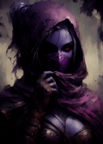
Denoting a point for lack of title. Good color scheme. It's probably not an eye-catcher since plenty have similar covers with waifu bait. Art is on point though with most space being utilized.I used Seaai art, thankfully it's free and got pretty good results from it.
View attachment 30356
Lovely font, color, and placement for your title. Wonderful color scheme with superb lighting. No amount of space is left without detail. Based on cover alone, I would read this, or buy just to have the art on my shelf. My personal bias has an issue with the author's font but that is not an issue.
I would but it is very difficult to tell without looking carefully.Thanks ? Edited it with gimp but would you believe the base image is AI?
Is my new book cover cool?发布你的封面。我给它评分。非常
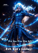
Looks cool. The color pallet is good but lacks good contrast for the blues. The title is good but the font is a bit odd despite its good color scheme. The hands look weird but barely noticeable.Is my new book cover cool?
Thanks for your suggestion, I will try to change it看起来很酷。配色很好,但蓝色的对比度不够。标题不错,但字体虽然配色很好,但有点奇怪。手看起来很奇怪,但几乎看不出来。
2.3/5
Made this by myself (still an amateur)Post your cover. I'll rate it. Super simple.

Sorry for the late reply. Been busy irl. Denoting 1 point for lack of title. Art looks good with decent color pallet. I feel like there is a lot of unused space but that could be where the title goes.Made this by myself (still an amateur)
I like the colors but the contrast between the background and the character is a bit blurred. Most of the space is taken up, except at the top but the title would fit there well.No title I know.
U guessed it right. My long-@ss title should be there. Still, thanks for the rating!Sorry for the late reply. Been busy irl. Denoting 1 point for lack of title. Art looks good with decent color pallet. I feel like there is a lot of unused space but that could be where the title goes.
3/5
1st: The contrast is lacking as the white from the character blends too much with the white sheets of the background. Same with the title color as it blends in too much. Though I love the font and placement. Almost all of the space has been used up so good job.View attachment 30482View attachment 30483
I'll post my other two commissioned covers later. :c They're too large for this post, and one isn't on this tablet. Enjoy the lovely specimen of men.
With the title,U guessed it right. My long-@ss title should be there. Still, thanks for the rating!
yesCan I PM you my cover?
#1 Denoting a point for lack of title but since it's unfinished, I'll let it slide. Looks like a pretty good start with the centered character and the broken moon, er planet? I don't know.
Let's give a try. Here mine.Post your cover. I'll rate it. Super simple.


#1 Good color pallet with amazing contrast. Perfect title placement and font. The whole aesthetic from the numbers at the bottom to the titles at the top.Let's give a try. Here mine.
Wonderful color pallet. Beautiful art that shows a story in itself, fully embracing the term, "a picture is worth a 1000 words." Not my first choice for a font but fitting for the genre.
Denoting a point for lack of title but I assume that you intend to put it in the open space up top. Wonderful color pallet and contrast!
These were all really nice. Just waiting for the moment when someone post a completely white or black rectangle as a cover.#1 Good color pallet with amazing contrast. Perfect title placement and font. The whole aesthetic from the numbers at the bottom to the titles at the top.
5/5
#2 Same as above but the color contrast between the character's color pallet and the background seems to meld a bit more.
4.8/5
Wonderful color pallet. Beautiful art that shows a story in itself, fully embracing the term, "a picture is worth a 1000 words." Not my first choice for a font but fitting for the genre.
5/5
Denoting a point for lack of title but I assume that you intend to put it in the open space up top. Wonderful color pallet and contrast!
4/5
With title: 5/5 depending on title details