Esden-Noir
I might think a lot, so let me think
- Joined
- Nov 15, 2025
- Messages
- 57
- Points
- 18
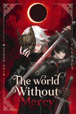
So basically, last time I released a novel named "The World Without Mercy" I'm thinking that I've rewritten majority of the original work, I'll start releasing the novel with a full update. New cover art, new chapter, and a full rework. I've gave the new cover art under here. I'd say it captures the story more then the last one. But what I'm here for today, I don't know how to write a compelling synopsis for the novel, should I go with a 3th person view or a first person view for the synopsis? And how much should I spoil on it.
Here I've gave my synopsis: give cretinism. Rate it. Or
In the shadowed veils of a world where demons stir in forgotten seals and mythical bloodlines burn with forbidden fire, Sylas is forged in the crucible of loss. Orphaned and adrift, he finds fleeting sanctuary in Mercy's embrace—a woman whose quiet compassion shields him and his steadfast friend Kael from the encroaching storm of war.
But when a ruthless decree from the Eclits Jurisprudence brands their haven heretical, horrors erupt that twist love into nightmare. Scarred in body and soul, Sylas taps into Omnimancy—a volatile magic that ignites only when one confronts the abyss, fueled by a vow etched in blood: revenge.
Guided by enigmatic captains of war like Ashrosa and the wry Esmeth Rowan, Sylas navigates treacherous factions, arcane enigmas, and visions of his own fractured self. In a realm where spells demand your essence and faith crumbles to dust, every alliance hides a dagger, and power exacts the ultimate toll: the soul itself. Can Sylas harness his forsaken legacy to defy the darkness, or will his quest unravel into a philanthropy born of rot—saving nothing while damning all?
The World Without Mercy is a pulse-racing dark fantasy of visceral magic, fractured bonds, and defiant fury—where heroes inherit ruin, and every strike echoes eternity. For readers who crave the intricate lore of The Stormlight Archive and the raw emotion of The Broken Earth, this saga seizes the imagination and refuses to let go.
And the link to the said novel is here:
 www.scribblehub.com
Here I've gave my synopsis: give cretinism. Rate it. Or
In the shadowed veils of a world where demons stir in forgotten seals and mythical bloodlines burn with forbidden fire, Sylas is forged in the crucible of loss. Orphaned and adrift, he finds fleeting sanctuary in Mercy's embrace—a woman whose quiet compassion shields him and his steadfast friend Kael from the encroaching storm of war.
But when a ruthless decree from the Eclits Jurisprudence brands their haven heretical, horrors erupt that twist love into nightmare. Scarred in body and soul, Sylas taps into Omnimancy—a volatile magic that ignites only when one confronts the abyss, fueled by a vow etched in blood: revenge.
Guided by enigmatic captains of war like Ashrosa and the wry Esmeth Rowan, Sylas navigates treacherous factions, arcane enigmas, and visions of his own fractured self. In a realm where spells demand your essence and faith crumbles to dust, every alliance hides a dagger, and power exacts the ultimate toll: the soul itself. Can Sylas harness his forsaken legacy to defy the darkness, or will his quest unravel into a philanthropy born of rot—saving nothing while damning all?
The World Without Mercy is a pulse-racing dark fantasy of visceral magic, fractured bonds, and defiant fury—where heroes inherit ruin, and every strike echoes eternity. For readers who crave the intricate lore of The Stormlight Archive and the raw emotion of The Broken Earth, this saga seizes the imagination and refuses to let go.
And the link to the said novel is here:
The World Without Mercy
Sylas was raised on a lie: love still exists. and warmth does not belong only to the burn of fire. grown up in the Orphanage of Faith, protected by the head nun—whose quiet compassion stands as the last fragile barrier against the Eclits Jurisprudence, a tyrannical order that descends...
Last edited:

