Pixytokisaki14
Least crazy gun enthusiast
- Joined
- Apr 22, 2022
- Messages
- 356
- Points
- 133
I couldn't find the original cover 

Hans flexing on everyone I see.You know the drill, time-traveling bro.
View attachment 30287View attachment 30288View attachment 30289View attachment 30290View attachment 30291View attachment 30292View attachment 30293View attachment 30294View attachment 30295View attachment 30296
View attachment 30297View attachment 30298View attachment 30299View attachment 30300View attachment 30301View attachment 30302View attachment 30303View attachment 30304View attachment 30305View attachment 30306
View attachment 30307View attachment 30308
View attachment 30309View attachment 30310View attachment 30311
Supremely based.You know the drill, time-traveling bro.
View attachment 30287View attachment 30288View attachment 30289View attachment 30290View attachment 30291View attachment 30292View attachment 30293View attachment 30294View attachment 30295View attachment 30296
View attachment 30297View attachment 30298View attachment 30299View attachment 30300View attachment 30301View attachment 30302View attachment 30303View attachment 30304View attachment 30305View attachment 30306
View attachment 30307View attachment 30308
View attachment 30309View attachment 30310View attachment 30311
Do it.I'm surprised no one haven't posted the scribble hub cover yet
Really good contrast with eye catching effects. The title is a bit off center to the left and the font feels bland but the color is good. There's a lot of extra free space, which is okay.
Amazing concept and design. Well thought out contrast in both character design and between top and bottom. Well placed title with fitting font. The background is also wonderfully filled with pleasing art. I'm not a fan of AI but I get that we have to work with what we have.Adding mine to the mix. Although, understandably, it probably doesn't make much since without reading the story.

Very eye catching characters but the color pallet of black, red, and grey makes most of it meld together. The title has a good font, color, and is well placed.Thank you!
Props for using canva. I too enjoy turning celebrities into 2D dress up dolls.View attachment 30277
I made this thing in Canva btw
Denoting a point for lacking a title. There is room near the bottom for it. Absolutely gorgeous, otherwise! If this was on a shelf, I would pick it up.View attachment 30280
It's for an insect hive queen story.
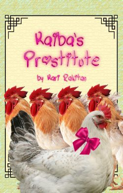
4 years and still don't know the chicken and roosters are for. Love the title and color pallet. Could be easily chosen by cover alone.
Decent cover. It fits the vibe of the title. Though the title is hard to read with the white-ish background. No unused space so good job.
#1 very good color pallet with eye catching elements throughout. Zero wasted space. Title is clear with a good font and color. Would probably see on trending.
Love the use of various colors in the title to contrast the Grey's and whites of the character and background. Though the font for Project Ninety Seven is a bit hard to read despite looking really cool.
#1 3/5You know the drill, time-traveling bro.
View attachment 30287View attachment 30288View attachment 30289View attachment 30290View attachment 30291View attachment 30292View attachment 30293View attachment 30294View attachment 30295View attachment 30296
View attachment 30297View attachment 30298View attachment 30299View attachment 30300View attachment 30301View attachment 30302View attachment 30303View attachment 30304View attachment 30305View attachment 30306
View attachment 30307View attachment 30308
View attachment 30309View attachment 30310View attachment 30311
Thanks for this. I've always wondered about the impression of others with the covers I made, so this is still a good feedback.#1 3/5
#2 4/5
#3 3.5/5
#4 4/5
#5 4/5
#6 4.5/5
#7 3/5
#8 4.5/5
#9 5/5 You can see a major shift in the color styles between 9 & 10 that really makes it stand out more to the naked eye.
#10 5/5
#11 4.5/5
#12 5/5
#13 4/5
#14 4.5/5
#15 6/5
#16 4.5/5
#17 4/5
#18 3/5
#19 4.5/5
#20 4.5/5
The other world series has some really good art as well as a great story that fits with the style. Sorry I couldn't spend more time on it. There was a lot a once. Well placed titles and fonts.
#21 5/5
#22 3.8/5
#23 4/5
#24 4.5/5
#25 5/5
These last three are beautiful! Absolutely stunning and worthy of a museum exhibit of phenomenal artwork
Nope. I don't. Even if it looks like it, it's not my intention.Hans flexing on everyone I see.
Denoting a point for lack of title. Could easily see it in the top right behind her head. Most of the space has been used so good job there. This doesn't tell me much about the story other than give me a character design and a the local fauna. Good art but her left knee and hands are a little off.
The title, logo, and color pallet are great. Thecontast between blue/white/purple and yellow/white/brown on the left and right are wonderful. Eyes could be lined up better but that isn't a big issue. The author/illustrator and volume number make it feel like a published light novel.
Thanks in advance for the feedback! A friend did the art, but I made the title/logo (I also made @/Glitched's title/logo.)
I was gonna say that this fits the perfect vibe of an early 2000s thriller/horror novel but now that you say it's a teen slice-of-life romcom, I think I may need to rethink this. Color contrasting the face and splatters is well done for horror. for slice-of-life romcom, I would put a PNG flower on her hair and lighten the red shading.
I love it. The cover is very traditional. This is a personal bias so you don't have to take this to heart but I am not a fan of having the author's name being bigger than the title because it draws your eyes to that before the title itself. I can understand for marketing your brand but it can be very annoying for potential readers picking it up to read the title. Otherwise, it seems perfect.I just made this one.