Representing_Tromba
Sleep deprived mess of an author begging for feedb
- Joined
- Jan 29, 2020
- Messages
- 6,014
- Points
- 233
Post your cover. I'll rate it. Super simple.

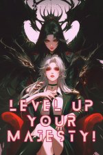
Smug. Nice color pallet that is attractive to the eye. Gonna have to denote a point for lack of title. Well designed but the fingers(specifically the ring and pinkie) throw me off.
I'll take it, it's AI.Smug. Nice color pallet that is attractive to the eye. Gonna have to denote a point for lack of title. Well designed but the fingers(specifically the ring and pinkie) throw me off.
3.5/5

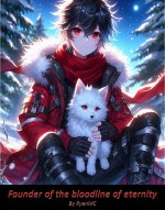
Interesting design with an eye catching colorful cast. I will have to denote a point for the lack of title. Though I can understand the long title taking up too much room. The horse is giving me PTSD.
My title's too long to include without taking up half the art.

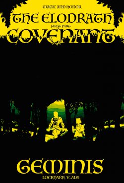
Very basic and not very appealing to the eye. The red, black, and grey are good colors but not great at standing out. Title's not bad but with where it is placed, it feels like an afterthought. Some good color contrast might help it.
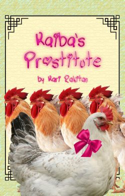
Looks good but not very eye catching. As with the last one, red, black, and grey are good colors but not great at standing out. Though the overhead POV shot is nice. The title is good, eye catching, and in a good font. However, the lack of space being used in the top left and bottom make it feel off.
I love the contrast of purple and grey on the horse. Very much reminiscent of old Black Beauty covers. The person below the horse has some autonomy errors but none you would notice at a first glance. The title size, font, and placement is pure perfection. Though the black and purple triangles on the top left and bottom right feel like too much to me personally. Perhaps an old portrait style border would fit the aesthetic better?

ThanksVery basic and not very appealing to the eye. The red, black, and grey are good colors but not great at standing out. Title's not bad but with where it is placed, it feels like an afterthought.
Anime girl is tried and true but can be seen as basic. White and military grey aren't usually very eye catching but the use of red and blue in the background help to make it stand out. The title is clear with another layer of blue and red to contrast the fox girl but the font can make it hard to read.How about mine, it took me a little while to do it: