Thoughts on W.I.P Cover page

MR_Ethan

Member
Joined
May 19, 2024
Messages
33
Points
23
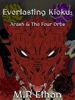
Been working with my artists for a while. We are waiting a bit before moving onto the next stage of rendering but wanted to see if this grabs people's attention. I did the text so that's why it's just a plain color.
 

Attachments

  • WN COVER V1.jpg
    WN COVER V1.jpg
    206.4 KB · Views: 55

KoyukiMegumi

Kitty
Joined
Jun 11, 2021
Messages
1,201
Points
153
:blob_aww: Why does everything I look at that you do remind me of a show or game? I see that and I think of Dragon Ball. Is it the art style? Hm... I don't know why.

For some reason, I am always attracted by bright colors. It's where I look more usually. Though, it's a nice piece of work!
 

MR_Ethan

Member
Joined
May 19, 2024
Messages
33
Points
23
:blob_aww: Why does everything I look at that you do remind me of a show or game? I see that and I think of Dragon Ball. Is it the art style? Hm... I don't know why.

For some reason, I am always attracted by bright colors. It's where I look more usually. Though, it's a nice piece of work!
Dragon ball is one of my favorite shows. This is the first I've heard that it looks like dragon ball-esc. Maybe you're thinking of Shenron? Although.. As much as I love the show, it was not an inspiration for our work
 

J_Chemist

Well-known member
Joined
Jun 17, 2022
Messages
2,191
Points
153
I like it. It's not eye catching because the colors are relatively flat so in a sea of covers, I might glaze over it. But as a WIP, it actually is nice compared to all the Anime Character covers strewn all over the place.

Also, I would make the orbs pop if you're going to add more colors/details. As it is now, the book title really covers up the top two orbs and takes away from their presence.
 
Last edited:

KoyukiMegumi

Kitty
Joined
Jun 11, 2021
Messages
1,201
Points
153
Dragon ball is one of my favorite shows. This is the first I've heard that it looks like dragon ball-esc. Maybe you're thinking of Shenron? Although.. As much as I love the show, it was not an inspiration for our work
Yes, for some reason, I thought of him. :blob_reach:
 

melchi

What is a custom title?
Joined
May 2, 2021
Messages
2,878
Points
153
Took a moment to notice that there were 4 orbs.

I might suggest the line work could have higher contrast.

Also some of the text might not be readable in a thumbnail.
 
D

Deleted member 84247

Guest
Took a moment to notice that there were 4 orbs.

I might suggest the line work could have higher contrast.

Also some of the text might not be readable in a thumbnail.
Yeah, possibly a better outline for the text? Like a thicker black outline.
 

MR_Ethan

Member
Joined
May 19, 2024
Messages
33
Points
23
It seems I posted a less saturated one.. My bad, wrong file. But I agree with the lining. The text is premature because I did it so it's just a placeholder for now.

I edited the original thread message to have the right one.
 

Lloyd

Funny Guy :)
Joined
Jun 2, 2020
Messages
2,538
Points
153
Looks better than a lot of stuff on this site.
 
D

Deleted member 84247

Guest
It seems I posted a less saturated one.. My bad, wrong file. But I agree with the lining. The text is premature because I did it so it's just a placeholder for now.

I edited the original thread message to have the right one.
It looks great!
 
Top